By Cindy Botha | Product/UI Designer, Data Division
We are living in a world of quickly evolving technology. Analytical software for life sciences with poorly designed user interfaces can result in unproductive research and can be time-consuming, tedious, and frustrating. UX (user experience) design holds great potential for scientific software that handles big data.
Imagine having complex data systems but providing software that is slow and hard to use. The best pharmaceutical companies want their scientists and data analysts to have the most effective tools possible.
Life science, as an industry, is vast. Life science and pharmaceutical industries collect and leverage vast amounts of data. The technologies behind these complex data are extremely powerful and getting smarter by the day.
It is sometimes easy to forget that real users will need to handle this information. Interfaces and user experience act as the conduit between technologies and the user. A user-focused approach to understanding users’ needs leads to informed decision-making about what data needs to be shown and the best ways to display that information.

Understanding User Experience (UX)
Big data will always be complex, but that doesn’t mean user experience must be complex too. UX methodology is a collaborative and iterative process that debilitates innovation to solve a problem. UX design serves to maximize the user’s satisfaction when using a product. When creating software, it does not matter how powerful and robust the back-end system and the product data is, if it is rendered by an inaccessible and unintuitive, unengaging UX.
User Experience (UX) Principles for Life Science
- Balance
When design elements on the screen are even, the design is balanced. There are three types of balance when it comes to design:- Symmetrical – The dashboard layout is equal or a mirror image, creating a proportional balance.

- Asymmetrical – Both sides of the dashboard are unique, but both have the same weight.

- Radial – There is a center point of the dashboard with objects placed around it. This type of balance draws your eyes inward to the center focal point.

- Symmetrical – The dashboard layout is equal or a mirror image, creating a proportional balance.
- Prioritize information
Crucial information should be at the top of the screen because this is where the user’s eyes are more likely to be drawn. This will give the user a quick overview.

- Logical layout
Layout should be easy for the user to understand and follow—consistent formatting and design throughout the application. If the dashboard contains several tabs, each tab should have a similar format, styles, and layout. - Think through users’ mental models
With software applications, users expect a specific sequence of events. When dealing with big data sets, it is essential to align the software’s conceptual model with the users’ mental model. - Oversimplify functionality
It is essential to show functionality clearly and not to hide any vital feature under drop-downs. When creating an interface, less is more. - Select the right visualization methods
Choosing the right visualization to achieve specific goals is a critical factor in unlocking the usefulness of complex data.- What data do I want to users to see?
- What is the most effective and sufficient way to view large data sets?
- How do I determine the dominant dimensions?
- What data do I want to users to see?
- How much data do I want users to see?
- When should I visualize data?
- How do I determine the most critical data?
- How do I determine the dominant dimensions?
- What is the simplest way to see large data sets?
There is work to be done in many areas of big data processing technologies to achieve this goal, but great user experience is one of the critical prerequisites.

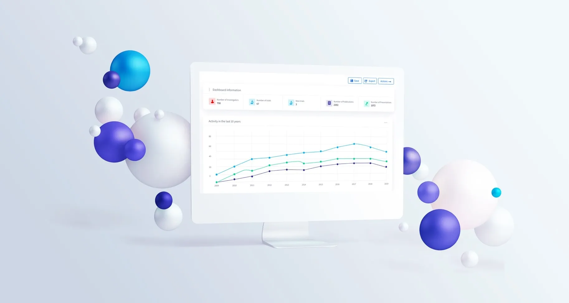
Data Visualizations for Clinical Operations, Medical Affairs, Commercial, and Analytics Teams
Anju Software provides end-to-end software solutions that help customers manage mission-critical pharma processes and turn data into actionable insights. Anju Software also provides user-friendly interfaces that make the data and insights easy to use.
Do you have questions, or would you like to learn how the data visualizations in our data platforms ta-Scan (Clinical Operations, Medical Affairs) and Zephyr (Medical Affairs, Commercial) can help YOUR team? Please contact marketing@anjusoftware.com for more information.
